Capital One Auto Navigator - 10 Weeks, 5 Functions, Real Results
In February 2021, just three months after I joined Capital One, we faced a challenge: redesign the 7-year-old Auto Navigator experience in 10 weeks for the product's first national marketing campaign.
Some of what you’re going to read here might be the standard way of working at some companies, but at Capital One it was a significant change.
A new way of working:
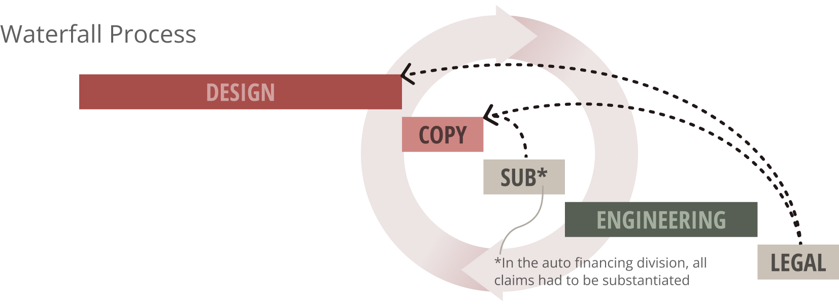
Business as usual wouldn’t help us hit this deadline. Design rarely took the time to understand how their designs impacted Engineering (any back end change required significant work). Engineering would wait for 100% final designs, Product would cut scope to hit deadlines. And Legal and Marketing, reviewing at the very end, often required changes, causing rework and delays.
Getting all of these teams involved earlier and more often was critical.
What I did:
Defined the scope:
We focused on front end changes only. This was the only way to launch a significantly improved user experience in 10 weeks.
We wireframed ideas quickly, so Engineering could help us understand which design decisions would result in back end changes.
Understanding our underlying tech was arguably the most important change to our process.
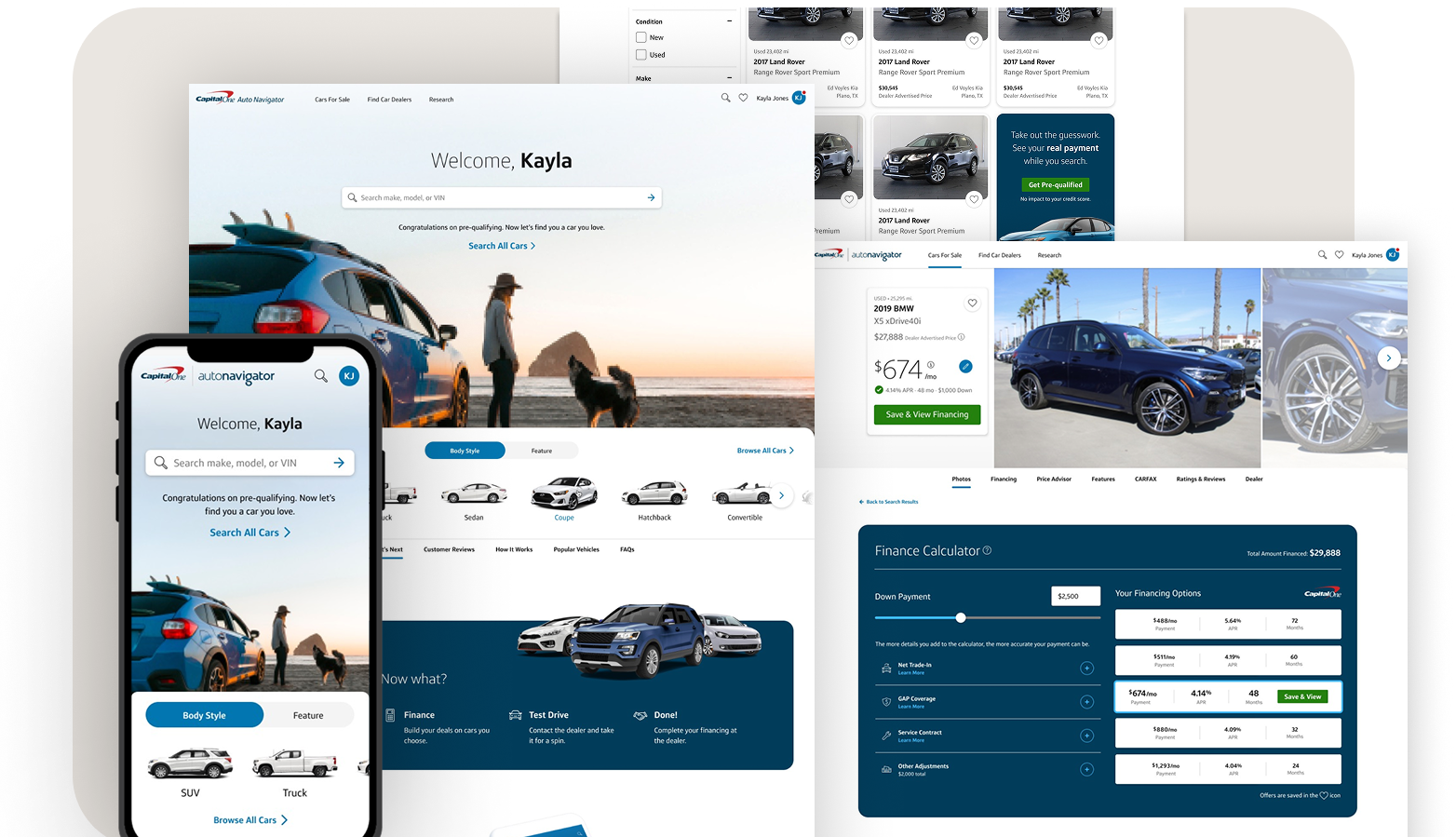
We set our focus on information hierarchy, UI design, natural-looking imagery, and copy improvements.
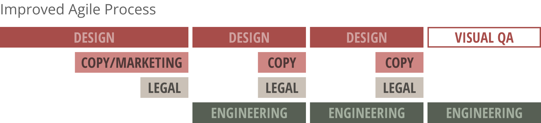
Aligned everyone early:
I identified key stakeholders, created a clear timeline with overlapping tasks and checkpoints, established a RACI, and set up structured reviews.
Created shared design principles:
I developed three principles that aligned Design, Product, Marketing, and Engineering on how we'd talk about and build the product:
Real: Real rates, real customers, real leads (expressed through natural photography)
Friendly: Car buying is stressful (expressed through soft shadows, rounded corners, helpful 7th-grade reading level copy)
Accessible: Better for all users, not just those with disabilities (expressed through standards and simple explanations)
These weren't just design principles - they were decision-making tools for everyone.
Changed how we worked:
I moved engineering from "waiting for 100% final designs" to "start building at 70% final" - all major decisions locked (layout, features), with 30% remaining for visual polish. This required building trust that designers wouldn't change their minds on the fundamentals.
I scheduled recurring weekly reviews instead of waiting until we were "ready." This kept us moving forward without getting too far ahead without feedback.
I leaned heavily on years of existing research and customer insights - we didn't need to research every decision because we already knew the pain points. We just needed to solve them.
Facilitated and led:
As facilitator, I translated design ideas to stakeholders in their language - not pixels and fonts, but trust, usability, clarity, conversion. I let designers run the show while providing context and unblocking when needed.
As leader, I saw the big picture. When a designer got stuck, I created collaborative "jazz sessions" where designers jumped into the same Figma file and designed together in real-time - no ego, no ownership, just getting to the best solution together. I identified what was working, aligned everyone on direction, and kept focus on agreed-upon scope while pushing the boundaries of what "front-end changes only" could mean.
Navigated the hard parts:
My design leader wanted to push features further than was possible. I had to reel him back and moderate design reviews, reminding everyone of the goal.
Engineering struggled to adapt to giving creative feedback and accepting incomplete designs. This required patience, discussion, and trust-building - showing them through consistent follow-through that designers would keep commitments.
The results:
The redesign lifted every conversion funnel metric:
Funded loans: +4.5%
Searches: +16%
Customers saving cars: +20%
Saved cars per customer: +3x
Completed applications: +13%
We delivered on time. We capitalized on the marketing campaign. And Design, Product, Engineering, Legal, and Marketing were working more collaboratively than they ever had before.
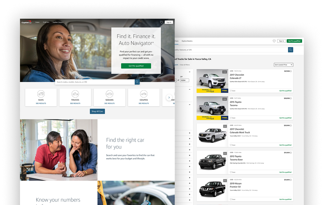
BEFORE: Impersonal, stale, intimidating
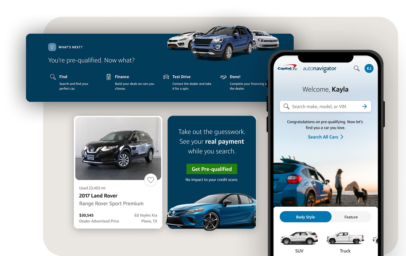
AFTER: Guiding, helpful, relatable, usable