Challenge

A worn-down team, a broken process, and a 12-week forcing function
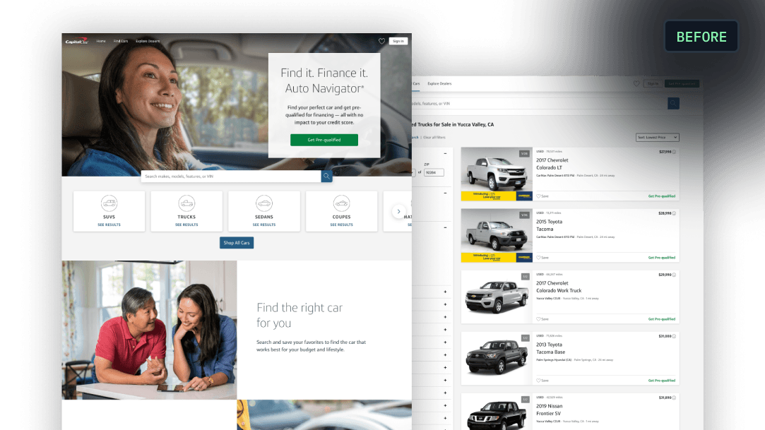
Capital One Auto Navigator redesign — before

The current experience was stale, with known pain points. Design concepts looked great in reviews but never shipped — until a national campaign made the status quo untenable.

I inherited a design team that was worn down. They'd been pushed to create bold, forward-looking concepts, work that solved real usability problems and looked great in leadership reviews. But it never shipped. Every quarter, the team got the same answer from product and engineering: too hard to build, too risky to change, we have other business priorities. Meanwhile, the UI was stuck in a 7-year-old design, and the UX was still causing customers the same frustration and confusion.

When I joined, I talked to team members to understand how everyone worked. There was a set way of working, and it was ineffective. There were long review cycles, a waterfall handoff to engineering, and legal reviews that arrived late, sending designs back to square one.

Then the business handed us a forcing function. Auto Navigator was launching its first national ad campaign in 12 weeks. My manager and I knew we couldn't send that traffic to an experience we already knew was broken. My manager called: "We need to launch the new experience before the campaign goes live." We knew what we needed to do, but we didn't know how.
Solution

A 10-week plan from design to deployment

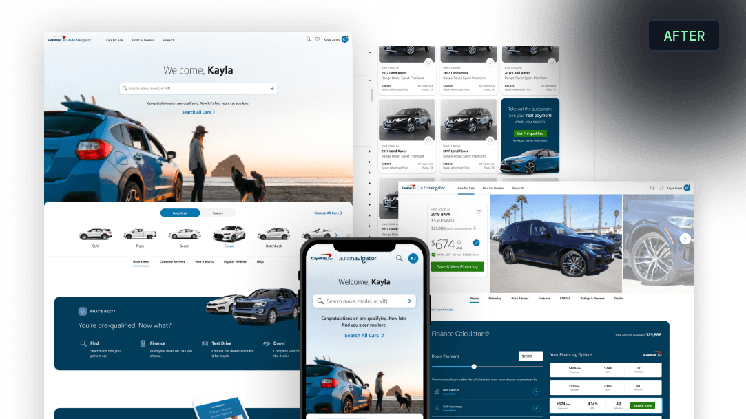
Capital One Auto Navigator redesign — after

Higher quality, faster — with product, engineering, and legal in the room together.

I built a 10-week plan to get from design to deployment, and set the tone early:

"We need to get to higher quality, faster."

And in the same breath, I laid out how. It meant a real agile cycle: two-week reviews with product, engineering, and legal in the room together, and engineers picking up designs before they were 100% locked. I coached the designers on getting more engaged in the tech stack so we could make more informed design decisions that only touched the front end. And every review was a check on that. If something needed backend work, we caught it early and adjusted.

Engineers were the hardest to win over. They wanted locked designs before they'd build. I convinced them to work from designs that were 80% done — every major decision final, small details still moving — so we didn't lose weeks on fine tuning the design before dev could start.

It's important to me that designers are good partners to engineers. They started trusting the process once they saw us deliver on our promise.

We grounded every decision in research we already had, and broke down the silos between designers. I called it "playing jazz": when someone got stuck, another designer jumped into the Figma file and iterated alongside them, live on Zoom, sharing ideas in realtime.

Results

Shipped on time — without touching the backend

+4.5%increase in funded loans
+16%searches
+13%completed applications

Every metric that mattered went up — and the process stuck as a better way of working.

We shipped on time, without touching the backend.

Most importantly, a tense project that could've easily become a "fire drill" was instead treated as a new, strategic and effective way of working smarter, faster and more deliberately alongside cross-functional partners.

Since the changes were limited to front end work, and the results were so undeniably strong, this project has always stood out to me as a clear example of why design matters. There isn't a lot in the design that we sacrificed. The only sacrifice was an older, established way of doing things.

When released, every metric that mattered went up: searches rose 16%, saved cars per customer tripled, completed applications rose 13%, and funded loans increased 4.5%.